
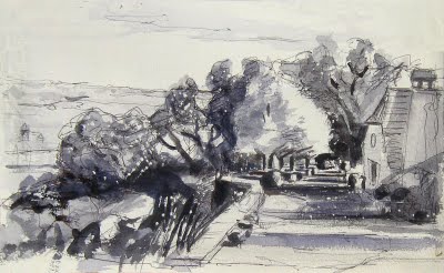
Interesting to see the same landscape view in three different mediums : drawing, watercolour & stone lithography. Different material, different effect. Each medium is good for certain effects. In the above three images,, watercolour is delicate colours & brushmarks, conté is so immediate & so fresh, lithography is good for a design, a powerful composition.…
Category: How to Paint & Drawing Techniques
Some on-line tips & advice on painting techniques by the painting tutor Adam Cope
WIP : compositional sketch & tonal ‘notan’
WIP ….WORK IN PROGRESS – watercolour – a tonal ‘notan’……WIP I’ve been working on a large oil painting these last three weeks. A commission. It’s 130 x 81 cm – approx 51 x 32 inches. Bigger than my usual size. Good to be doing something different. A lot of work, which I’ll post as WIPs…
Telly fans 9 – Child Portrait Tips
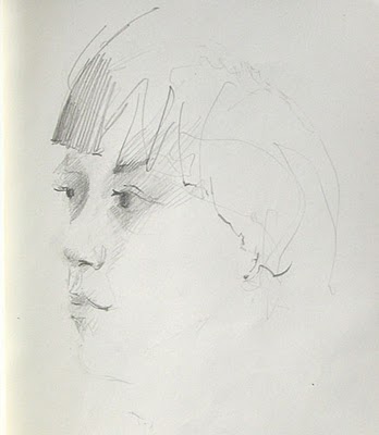
Maybe this looks like what Vally might look like some years on from now? Compare it with ‘Telly Fans 8’ below. Can you see the difference in age? Getting the age right is an essential part of a portrait, especially for a portrait of youth. Portraits of old age are easy in comparison!…
Sunflowers 8
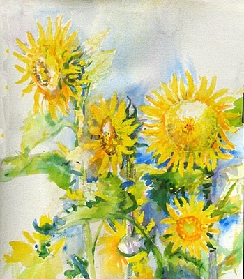
Some yellow acrylic highlights in this one, so not a totally Transparent Watercolour . Some paintings go that way & if they require you to ‘break the rules’ , then that is what must be done, as it’s picture-making first & foremost (& not some dreary, step-by-step, formulaic type of watercolour , which frankly, has…
Plein-Air Landscape in Acrylic at the Lay-In Stage
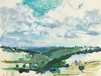
A demonstration piece from a recent Chateaux Painting Holiday, France left of in the lay-in or block-in phase
Chromatic Black in the Colourist Palette
WORK IN PROGRESS – UNFINISHED STATE ‘Mistletoe’ medium size oil on canvas 15 F ©adam cope Chromatic Black in the Colourist Palette Experimenting with a new mix for ‘black’. Lets call it a ‘chromatic black’ (as does Dan Smith oil paints) in the hope that it’s more colour friendly than soot (lamp black)& burnt bones…
Painting of Vines in Autumn – Large Size Plein-air Painting
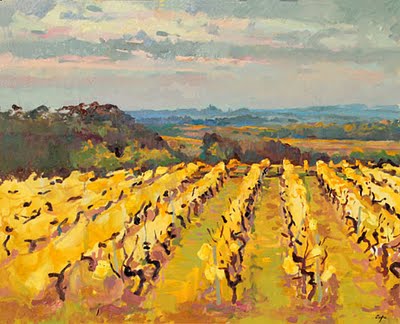
‘Semillion, Labadie, Monbazillac’ Large Size Oil on Canvas 81 x 65 cm (approx 26 x 32 inches) ©adam cope sold Here’s the finished state. Here’s the link to its Work In Progress : Lay-in for Plein-Air Large Oil Painting.I went out the next day for a second plein-air session with a mental note ‘yellow &…
Rembrandt’s Drawings of Children – Anticipation & Action
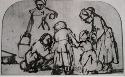
Rembrandt’s Drawings of Children These two drawings remind me of some of the storyboard sketches of Walt Disney’s ‘Nine Old Men’ period. The action & drama is supremely rendered with economy of means, a sure sign of mastery. Here’s what Wiki has to say about one of the ’12 Basic…
Rembrandt’s Gesture Drawing
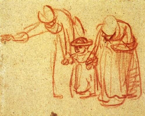
Rembrandt’s Gesture Drawing Rembrandt Harmensz von Rijn (1606-1669) Zwei Frauen bringen einem Kind das Laufen bei, um 1640 Kreide auf Papier British Museum, London, photo wiki Gesture_Drawing = https://www.wikihow.com/Practice-Gesture-Drawing Both these articles are great places to start reading about gesture drawing. Nicolades ‘The Natural way of Drawing’ is the best. I would add that because…
Learning to Paint? In Theory & in Practice
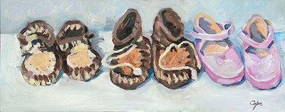
‘Tailles 16 à 21’ Oil on masonite 20 x 50cm © adam cope NFS detail This wise little saying makes me laugh & makes me think: ‘I used to have six different theories on how to raise children but now I have six children, I have no theories’ (don’t worry!! I dont have…