
WIP ….WORK IN PROGRESS – watercolour – a tonal ‘notan’……WIP I’ve been working on a large oil painting these last three weeks. A commission. It’s 130 x 81 cm – approx 51 x 32 inches. Bigger than my usual size. Good to be doing something different. A lot of work, which I’ll post as WIPs…
Category: Tonality
Tonality in painting & drawing. Monochrome greysacle of paintings. How light/dark works in a painting? Preliminary value studies.
Watercolour by Candle Light/value study
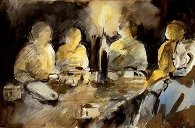
… and now for the candlestick, of course 😉 w & n neutral tint…. great for value studies in watercolour
painting of the dordogne river in winter – UNFINISHED STATE
UNFINISHED STATE WIP work inprogress ‘Ilots, Pontours, Dordogne – 2’ UNFINISHED STATE Medium Size Oil on Canvas 70 x 33 cm ©Adam Cope Actual Size Detail – to give you an idea of how the paint is applied Palette of muted winter browns in weak sunlight. Bright ultramarine reflections of the sky on still waters.…
tonality?
Here’s the last painting which had a strong tonal theme of black tree-trunks/white blossom. Here’s the same painting with the colour stripped out in PS via greyscale. Here’s the greyscale is changed by darkening the mid-tone grey in PS. Using Photoshop elements to help painting It’s more stormy with the white blossom more dramatic.…
Sunset : 21 December, longest night – Black in paintings.
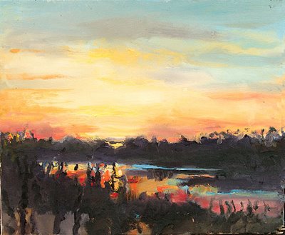
‘Sunset : 21 December, longest night’ medium size oil on canvas 8 figure (46 x 38 cm; approx 18 x 14 inches) © adam cope oil painting of sunset on longest night Something amazing happened yesterday. The grey skies that have weighed us under this last month parted & THERE WAS LIGHT. It felt like…
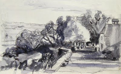
Quatorze Juillet en Dordogne
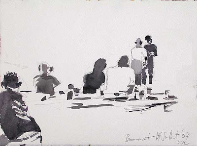
14 Juillet en Dordogne…parties & fireworks. Hoping to get out painting tonight (teaching tomorrow) as it is a good paint. Next post is about the English in Dordogne & house prices… & here’s an expert from last year’s bloggy Jour de la Republique… TONALITY : ’14 Juilliet – Fête de la Republique’ ‘Quatorze Juillet, Beaumont,…
Watercolour of The Great Sphinx of Giza
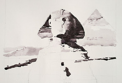
WORK IN PROGRESS UNFINISHED STATE DETAIL : ‘The Great Sphinx of Giza’ 2008 Watercolour. 60 x 77cm © The Artist.
TONALITY : ’14 Juilliet – Fête de la Republique’
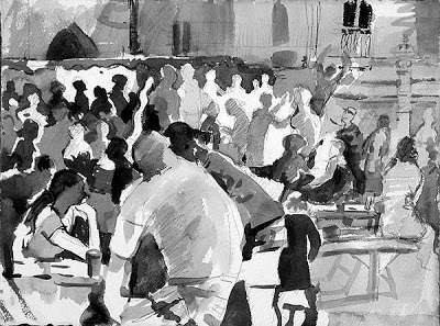
28 x 38 cm (15″ x 11″) Toutes Droits Reservés© The Artist. Click on image to enlarge (& see without the blur). Quatorze Juilliet in Beaumont town. Tressel tables, vin, grillade & frites. Everybody in town, including all the farming families. Disco, dancing, people watching, laughter & neighbours. Painting in monochrome, using Winsor & Newton…
NOTAN : ‘Vendeuses des Conserves au Marché’
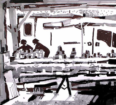
felt tip pens © The Artist. Sellers of tins of conserved duck at the french market place Attack of the giant white trades vans!! notan = design in black & white, tonality
NOTAN : ‘Poisson Frais du Marché’
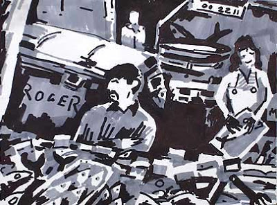
15 x 21 cm. Felt Tip Pens on Paper. Notan study. Tous droits reservés. Copyright – The Artist. BTW, this was a demonstration piece of last week’s painting workshop here in france French Market Places The fish-monger’s wife was a cubist delight, a three tone design with a flip of a fin. Market day is…