
Some colour theorists confute the notion of warm & cool colours, saying it is far too culturally relative to be constant. Red in one culture is perceived as cool whilst in another it is considered warm. Weither or not scientists use the concept of warm / cool is up to them, IMO. As painters, I believe it to be essential. As painters, we are more concerned with how colours relate to each others rather than finding definite, all embracing, verbal linguistic definitions of colour. Getting them to ‘work’ pictorially….is what interests me.
Bruce Macevoy at Handprint.com boils it down to saying that warm colours are more colour rich than cool colours. ie they are more intense & more saturated.
The visual push-pull that happens between warm/cool is because they are opposite sides of the colour wheel & thus give a greater contrast than a range of colours that are pre-domoninantly cool or warm colours.
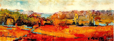
 ‘La Tete de la Vallée’
 Adam Cope
1997
oil on panel
62 x 23 cm
©
>>>>>>>>>>>>>>>>>>>>>>>>>>>>>
Paintings built with adjacent colours are less contrasty & tend to give a more harmonious end-result. These colours are adjacent to each other on the colour wheel & tend not too clash, have low contrast & can have the contiguity of ‘good neighbours’.
Here is a painting built using a gamme of cool greens & blues, darks & the odds warm brown. The key is low contrast & the mood I find, is cool & calm.

Adam Cope
1996
Oil on Canvas
©
The next painting is cool. Adjacent blues & turquoises & greens play off against high whites & yellows. The key is higher; not all cool paintings need to be glum & gloomy.
 ‘L’Esperance’
Adam Cope
©
Oil on Canvas
>>>>>>>>>>>>>>>>>>>>>>>>>>>>>>>>>>>>>
Try placing a warm colour accent on the focal point. The orange stroke is warmer than the background & thus atracts the eye… ‘Jewel in the Crown’ was what nineteenth century ‘how to paint’ books called this recipe.

’42 Degrees Centigrade’
Adam Cope
Oil on gessoed card
1997
©
Again, placing the warmest colour on the focal point…

Adam Cope
1996
oil on panel
32 x 26 cm
©
warm or cool ?? : this is the question you need to ask yourself when confronted with ‘tricky’ not quiet greys or could-be browns or might-be greens, colours which are difficult to perceive & even more difficult to mix.