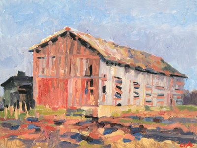

Oil on MDF panel
30 x 40cm (approx 12 x 16 inches).
©adam cope
Red in landscape painting acts as a magnet
Same barn as in ‘Sechoir à Tabac 1’. Same issues. Muted colour (‘anti-fauve barn’) or heightened ‘fauve’ colour:
…paint a rusty barn & keep it browny rust , rather than let it go over into heightened colour RED. – Adam in the post Fauvist Barns 1 : Muted Red & not Heightened Colour
..trying to keep a barn door rusty brownish red, rather than letting it slip into heighten, saturated colour RED. With a painter’s confession – there’s always apart of me that wishes to paint all bright & fauve. Or least prioritise colour in a composition. – Adam in the post Fauvist barns, heightened colour…Vlaminck & Kandinsky

30 x 40 cm.
Oil on Panel.
© The Artist.
150 euros via PayPal
POST-SCRIPTUM : well…. why not? I want red? I’ll give myself red. Here’s one of my painting that’s red, primary red & with no subtle deviations…

30 x 40 cm
oil on board
© the artist
SOLD
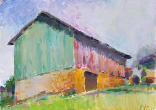
2017: POST SCRIPTUM … Here’s a green barn. A tobacco drying barn with planking painted green. Fun!
Fauvist Barns 1 : Muted Red & not Heightened RED
Fauvist Barns 2 : Fauvist Barns, Heightened Colour…Vlaminck & Kandinsky
Fauvist Barns 3 : Red in Landscape Painting
[button color=”green” size=”medium” align=”center” link=”https://www.artists-atelier.com//category/blog/colour-in-painting/”]Colour in Painting[/button]