
Painting exercises provide a focused environment. So, let’s keep this self-assessment targeted to the goals of these exercises. Creating a successful picture is far more complex than painting swatches. All the elements are interconnected—you can’t separate color from composition, for example. However, analyzing how you used the split-primaries will help you assess their effectiveness in your paintings.
Self-Assessment Questions
These questions will help you pinpoint how you used intense and muted colors.
Exercise 3: Intense painting using the intense split-primaries.
- You were asked to use only intense colours.Did you manage to stick to that?
- Bet that was difficult! Why????
- OILS & ALKYDS : Did you use white? Did it make the mixes more or less intense?
- WATERCOLOURS : Does the white of the blank page seem muted or intense?
- Where didn’t you use intense colours?
- Which colour is the least intense?
- Every painting will have a colour that is the most intense. Where you did place the most intense colour?
- Is the most intense colour difficult to see?
- Are there many intense colours?
- Is your eye attracted towards the most intense colour?
- Did you have to switch many colours? Was that difficult? (‘Switching’ colours is when you deliberately change one colour for another. In this exercise you will noty be able to mix every colour, so you will have to swop or ‘switch it for another colour).
- Are the switched colours in tune with the other colours?
- Did you have any difficulties mixing a good dark or a good black?
Exercise 4 : Muted painting using the muted split-primaries.
- You were asked to use only muted colours. Did you?
- Bet that was difficult! Why????
- Did you cheat & use black 🙂
- OILS & ALKYDS : Did you use white? Did it make the mixes more or less muted ?
- WATERCOLOURS : Does the white of the blank page seem muted or intense?
- Which colour is the most muted?
- Which colour is the least muted?
- Where did you avoid using muted colors? Why?
- Every painting will have a colour that is the most muted. Where did you place this most muted colour?
- Is the most muted colour difficult to see? Does it attract your eye ?
- Are there many muted colours?
- Is the eye attracted towards the most muted colour?
- Did you have to switch many colours? Was that difficult?
- Do the switched colours harmonize with the other colours?
- Did you have any difficulties mixing a good dark or a good black?
Sometimes we can’t see our own painting…
I believe the first step of assessement is clear, bare observation. Try to see what you are looking at before you judge it.
Gallery of Homework
Now, let’s put your color theory knowledge to the test!
Question 1 : Can you tell which paintings used a predominantly muted palette and which used a predominantly intense palette?
Question 2 : Analyze how the artists used color in these paintings. Refer to the self-assessment questions above to guide your analysis.
Question 3: Which painting do YOU think is the best example of a muted painting? Which is the best example of an intense painting? Why?


Colours do things to each other !
A common discovery from these exercises is the difficulty of painting with only “pure” intense colours or only muted colors. Why? Because colors influence each other, especially when juxtaposed. (Even when they’re not side-by-side, they seem to interact!) Lay down one color, then add another somewhere else…and they change each other! What looks muted before on the palette becomes intense when laid down besides another certain colour that once seemed muted. They change. A painter must be alive to this constant interplay.
“Painting is the ability to surround a Venetian red so that it looks like vermillion.” – DEGAS
However, we can say that a painting has either a predominantly muted or intense palette — but with some intense accents or muted sub-themes.
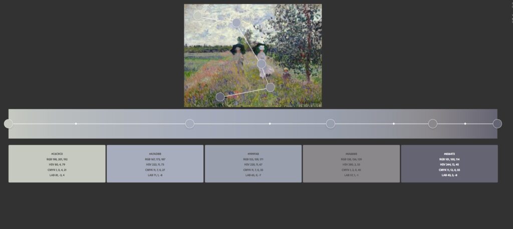
Mostly muted, with some intense accents
Example of a painting with a mostly muted palette but with some intense accent colours.
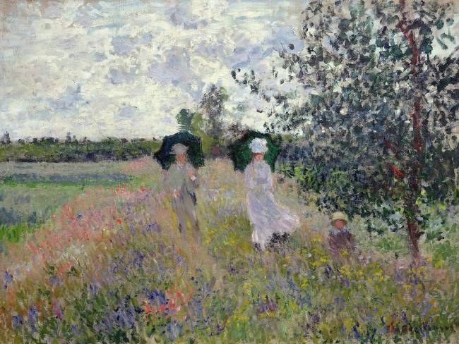
- Notice the white in the clouds and the lady’s hat.
- Observe the intense red poppies—do they become paler and grayer as they recede?
- Look at the violets. Where are the most and least intense violets?
- How does Monet use muted violets?
- See the delicate grays woven throughout the painting.
- Observe the muted greens and browns. Do they jump out?
- Look at Monsieur’s jacket. Is it green? Does it blend into the fields more than Madame’s white dress?
To my eye, the muted greens and browns separate the reds and violets, and give value to the whites, allowing them to sparkle. Madame’s white costume and the clouds’ silver lining are a dazzling response to the soft muted grays. It’s the muted colours that weave this painting together.
The infinite way in which
RUSKIN
everything alters everything else.