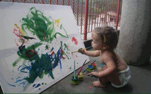
Making paintings with a limited number of paints is probably the best way to learn about colour in painting.
Our materials lists feature a carefully chosen selection of colors, with the split primaries at their core. This mini-course will familiarize you with these six paints and the mixes they create. Learning these mixes will noticeably improve your painting and prepare you for our in-person workshops.
I have worked through these Split-Primaries exercises over ten times. I learnt the spilt-primaries early on & still use them regularly. They are at the heart of my love of colour. Understanding intense & muted colours is vital to any artist’s use of colour.
This online course is aimed at all levels.
Course Outline
Here, in this mini-course, we are going to use only the Split-Primaries (plus white for oil painting).
1. First, we will mix some swatches.
2. Then we will paint two paintings: One intense & one muted.
3. Finally, we will look at how colour works in these two paintings (self-assessment).
Page Contents
- What are the Split-Primaries.
- What paints/pigments are the split-primaries?
- Temperature
- How to mix intense colours with them.
- Paint your own intensely coloured painting using the split-primaries.
- How to mix muted colours with them.
- Paint your own muted coloured painting using the split-primaries.
Suitable for all levels
Beginners
Some of the course content may be a bit difficult for absolute beginners. It may seem wordy & confusing because colour theory often is…
So dear beginners, get your paints out & simply do the exercises. You learn best by doing; first with narrow constraints (use only six colours). Understanding the theory comes afterwards, so please don’t be put off if you don’t understand everything that is written here upon your first reading. Just like learning to play Monopoly – it’s only when you’ve been around teh board a few times that you start feel relaxed.
It is recommended that you slowly work through the basics of this course in the comfort of your own home, since trying to do this for the first time, whilst outside in the field, whilst trying to paint what you see … can be difficult! First things first : learn the six paints of the split-primaries. Learn to mix colour with only these six colours.
Beginners will also learn about the paints in the materials list : their names & the basic mixes that they give. This will help you become familiar with intensity & temperature.
Advanced Painters
Advanced painters will benefit from painting their own two paintings (muted & intense). Then afterwards, using the self-assessment. How to use colour intensity & temperature are key to a successful painting. This invloves a conscious design decision, and many previous students have remarked that they found this to be the most difficult part of this course. So choose your subject mater carefully & develop the colour harmony by using muted or intense colours.
HOW MUCH TIME WILL THIS TAKE? I reckon two or three mornings. A couple of readings of this webpage & watch the YouTubes (maybe two hours). Then count about one hour for each mixing exercise. Then maybe one or two hours to paint a painting using these limited palettes. So say about two or three mornings in total. There’s also a self-assessment page, though sometimes we re-visit this together during the in-person workshop.
Limted Palette, Limitless Possibilities
We call this a ‘limited palette’ because we limit the number of paints. Six for the Split Primaries. Not every existing tube of paint is thrown into the mix! It’s not the number of paint tubes that count, but how you use them. “It’s easier to juggle with six balls rather than twenty.”
There are no shortcuts. So, get your paints out now and start mixing and painting. The more you experiment, the better you’ll understand how these colors work together. I hope you will fall in love with the range of painting possibilties offered by this limited palette.
.
Theory, practice & the natural intuitive way to paint… don’t blow my brain!

Paint, not light. Pigments, not rainbows. Illusions, not numbers. Experience, not theorems. Images, not words.
For artists, colour isn’t a sterile, abstract concept. It is part of what you need to create a good painting. Colour as paint & pigment. So to learn about colour, is also to learn about mixing actual paints together.
IMO, a lot of ‘colour theory for artists’ is far too abstract to be helpful. Us artists don’t think about colour in the same way as scientists do. Artists don’t use mathematical modelling. Instead, we rely on experience and “recipes” to mix desired colors from a small initial set of paints.
Sometimes talking about painting can make my head feel like it’s gonna explode. Colour in painting is abit like grammar for language: it’s something you need but is slippery difficult to grasp as abstract rules. It has to be applied. And it has to have a specific context : the same green used by Monet won’t look the same as when it is used by Turner. It’s wild how an artist can change a colour! ( or rather, change how it comes across).
Master this: for your natural style to emerge, engage every sense. Open the paint, smell the potential, hear the colors, feel the mix, and see for yourself.
What Are The Split-Primaries?
The Split-Primaries are a warm & cool cast of each primary (red, yellow, blue). There are SIX of them.
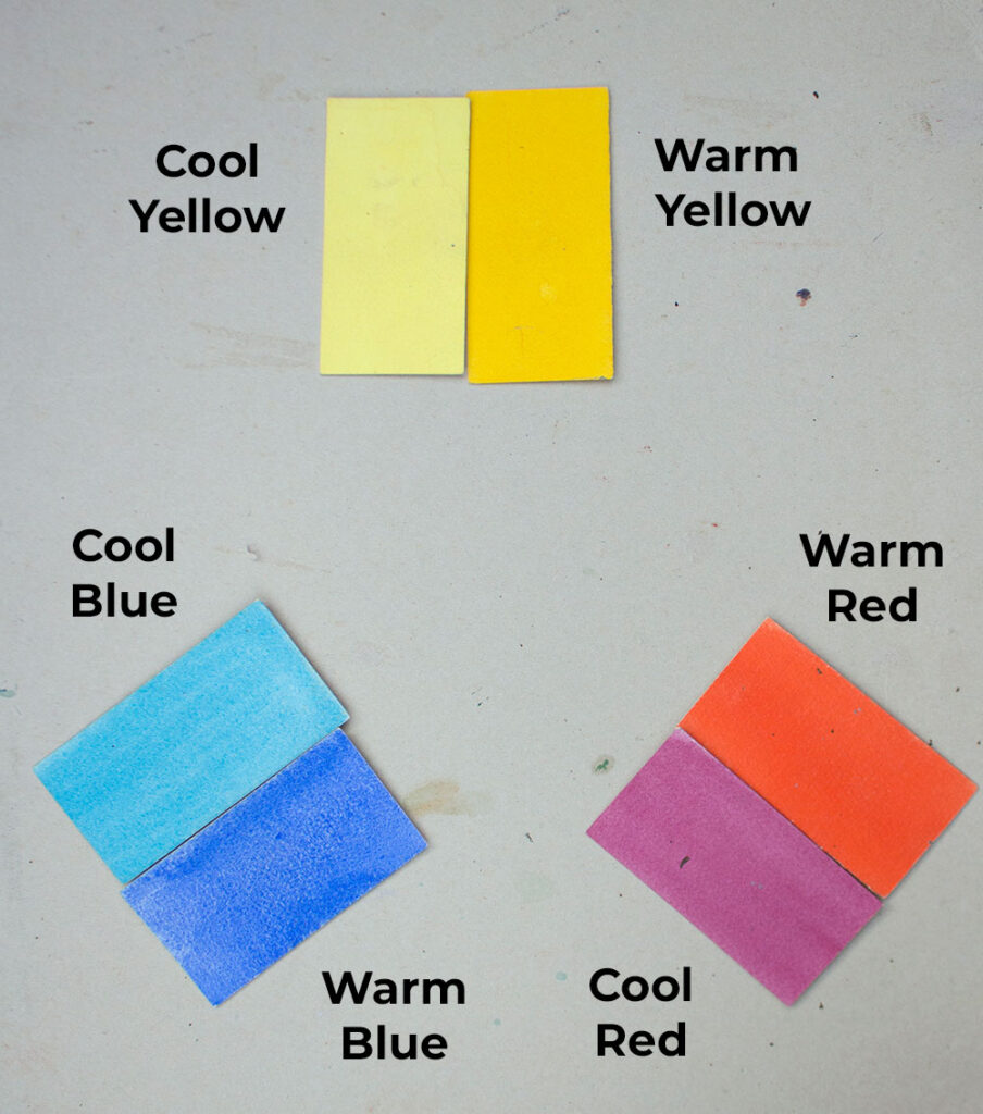
What paints/pigments are the split-primaries?
Cool Yellow = Leans towards the blue. A greeny yellow
- Lemon Yellow,
- Cadium Yellow Light
- Azo Yellow Pale (sometimes called Transparent Yellow Light or ‘Winsor Yellow Light’ for example)
Warm Yellow = Leans towards the red. An orangey yellow.
- Azo Yellow Deep (similar to Winsor Yellow).
- New Gaboge
- Cadium Yellow deep
Warm Red = Leans towards the yellow. An orangey red.
- Pyrrole Red ( Winsor Red for example or Pyrrole Orange for Daniel Smith watercolors)
- Cadium Red Light (or sometimes still known by it’s old name ‘pale’ …which doesn’t mean light in value but rather warm in temperature – get rid of that confusing name, dah!?!)
Cool Red = Leans towards the blue. A bluey red.
- Permanent Rose
- Alzarin Crimson
Warm Blue = Leans towards the red. A reddy blue.
- French Ultramarine Blue (important note: French Ultramarine is the red shade & is not the same as Ultramarine green shade)
Cool Blue = Leans to towards the yellow. A greeny blue.
- Cerulean
- Phthalo Blue / Winsor Blue (can also be used, but tend to be more intense and less versatile than Cerulean, which is greener & far more useful. My selection balances usefulness to painter with colour theory/dogma).
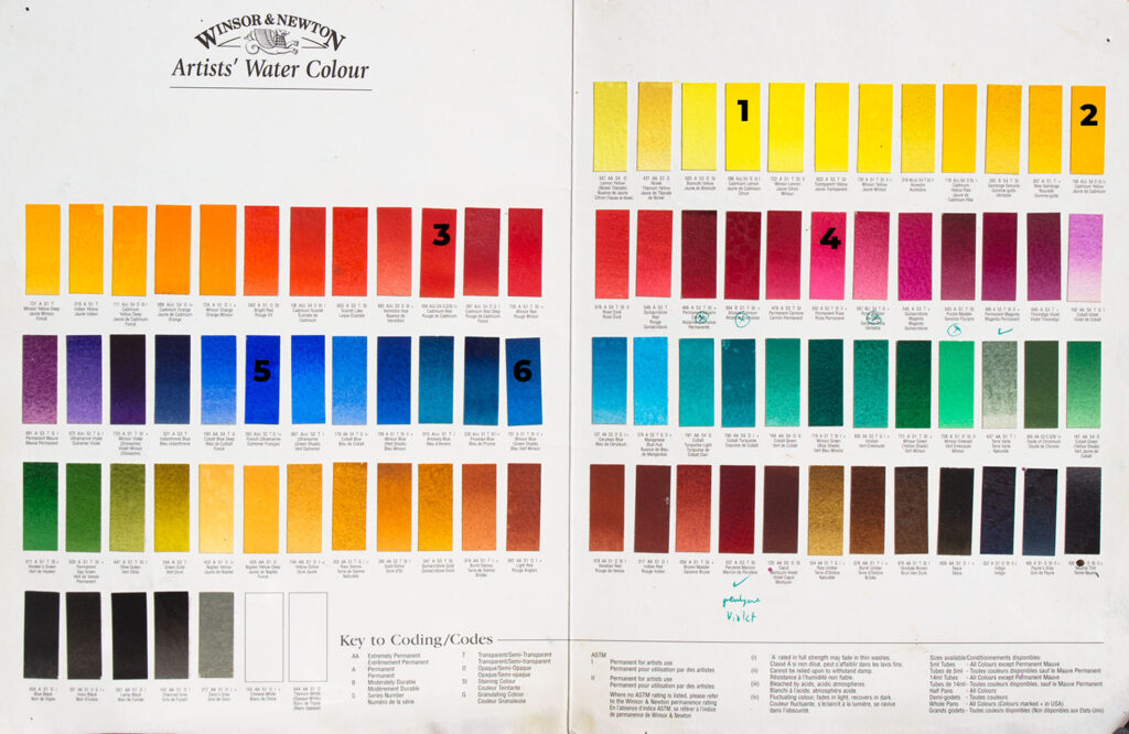
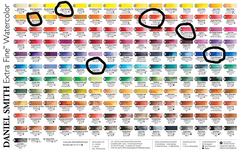
Daniel Smith Watercolours
- Hansa Yellow Light
- New Gamboge
- Pyrrole Orange
- Quinacridone Rose (or Alzarin)
- Cerulean (or Pthalo Blue green shade)
- French Ultramarine (red shade)
Why six primaries, not three ?
These six colors offer cleaner, more intense mixes than a traditional three-primary palette. You can also achieve a wider range of muted colors with these six paints than with the “true” primaries.
The idea of “true” primaries belongs more to scientific theory/dogma than practical painting knowledge. Since I’m asking you to travel to France with only six tubes (plus maybe a few more and your favourite colour – quand même!), I’ve chosen what I consider the most versatile split-primary palette.
A Limited Palette is a Good Map
We call this a ‘limited palette’ because there are only six paints. Knowing the split-primaries & what colours you can mix from them, gives you a map of colour. If you get lost, just come back to this map. If you want to know how to mix a colour, simply find it on the map. This helps you mix it. Some painters keep their colours map inside their paintbox, alongside their materials, for easy reference.
“It’s easier to juggle with six balls rather than twenty.”
That’s enough theory. Lets get mixing!
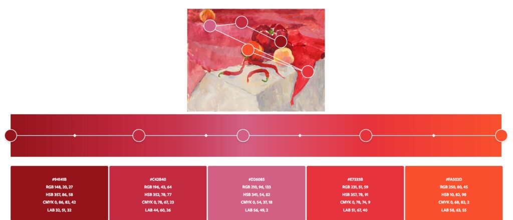
Colour Bias = cast, temperature. Note here the cool red is Alizarin, not Rose or Magenta. I prefer a bluer red than Alizarin, which I find to be somewhat browny.
Dr Kano explains the Split Primaries
I find Dr Kano easy to follow.
Nita Leland Explains the Split Primaries
There’s no point in reinventing the wheel… Her excellent book ‘Exploring Color Workshop’ is a good introduction to the split-primaries. It is recommended reading for all beginner level students. But you must actually do the exercises!
Wouldn’t you love to have a foolproof method of mixing color, so you can get the color you want every time?
Nita LELAND
‘MUD’ = muted or dull or unsaturated colours. But accidently MUD, if you can’t mix colour and end up with an unintentional brown mess.
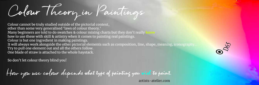
Adam says : Even brown can shine; even grey in the right place can glow. How you use colour depends on what type of painting you wish to paint. It might look like ‘mud’ if you wanted to paint a bright, intense painting. Or it might seem as sublime if you wished to paint a soft, muted painting, say something like the subtle slight shades of a dusty lanscape. Not brown but shifting vibrations softly sensed.
Temperature
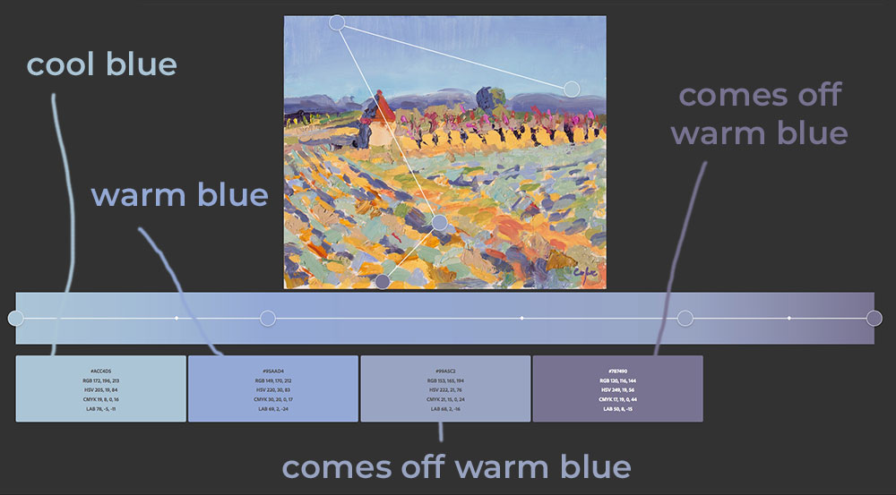
- A warm blue has a reddish cast (looks violet, has more red because blue + red = violet)
- A cool blue has a greenish cast (looks green, has more yellow because blue + yellow = green)
We’re getting warmer…
- Which red looks like it’s almost an orange? This has a yellow cast, which is considered ‘warm’.
- Which red looks almost like a violet? This has a blue cast, which is considered ‘cool’.
Intense Secondaries
Secondary Colors are the resulting hues of mixing two primaries. (R+Y =Orange, Y+B=Green, B+R=Violet)
Tertiary Colors are the resulting hues of mixing one primary and a secondary. (R+O=Reddy-Orange, Y+O=Yellowey-Orange, etc.)
INTENSE ORANGE
Warm Yellow + Warm Red = Intense Orange
INTENSE VIOLET
Cool Red + Warm Blue = Intense Violet
INTENSE GREEN
Cool Blue + Cool Yellow = Intense Green
Can you see which squares have the most saturated colour? You can not mix colour nor paint with colour, if you can’t first see colour.
Saturated coloured = intense colour
Pure shining hues have an intensity. They have lots of colour! We say they are ‘saturated’ with colour.
They also attract the eye. We like colour. Nature uses saturated colour as a signal : ‘look at me’ ; ‘come mate with me’ ; ‘don’t eat me’ ; ‘danger!’ … Train your eyesight to be sensitive to where the eye is being pulled towards.
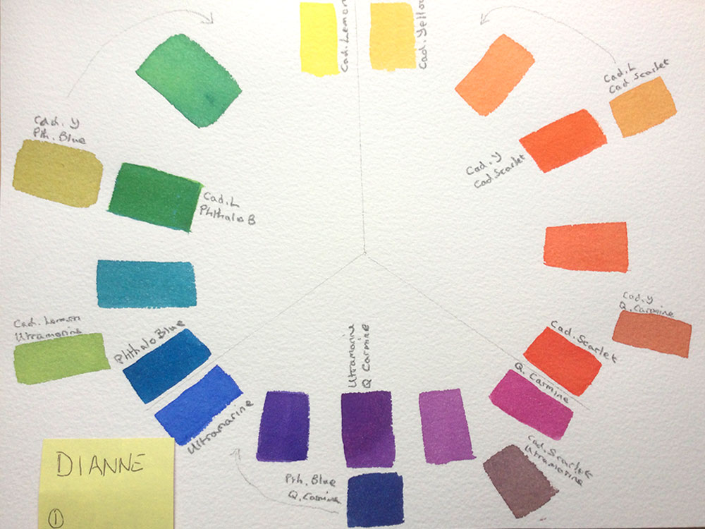
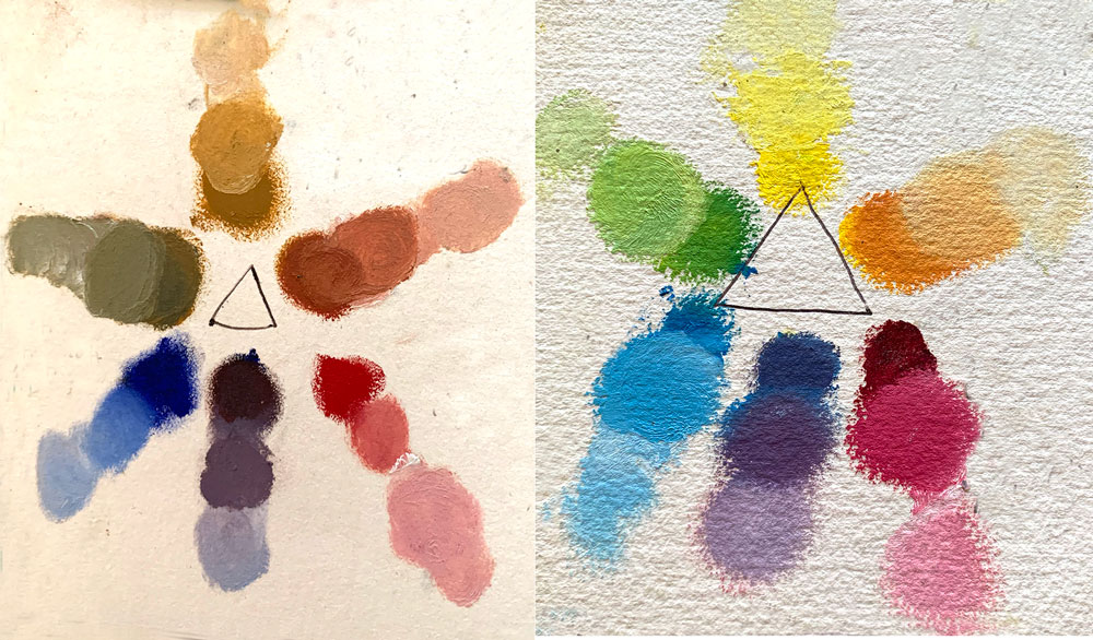
Exercise 1 : Mix The Intense Secondaries & Tertiaries & Lay Them Out In A Colour Wheel
Look at Diane’s colour wheel below. It was made by drawing around a plate. Observe that there are three lines from centre outwards. Don’t mix colors across the lines. For example, from the top: the warm yellow (Cadmium Yellow) is mixed with the warm red (Camium Red pale). Note that both these warm colours are inside the same lines.
For bright mixtures, follow this important rule: Don’t cross the black line!
Muted Secondaries from the Split-Primaries
Split-Primaries can give muted, ‘broken’, subtle or greyish secondaries as well. These are less intense, less saturated with colour :
cool yellow + warm blue = muted green
warm yellow + cool red = muted orange
warm red + cool blue = muted violet
Exercise 2 : Mix The Muted Secondaries & Tertiaries & Lay Them Out In A Colour Wheel
Look at Diane’s muted colour wheel below. For muted colours, mix colors across the lines. Or in this case, simply swop the position of a warm with a cool. For example, from the top: the cool yellow (Lemon Yellow) is mixed with the warm blue (French Ultramarine). The result is a muted green.
For dull mixtures, follow this important rule: cross the black line! or swop them over (as Diane has done below)!
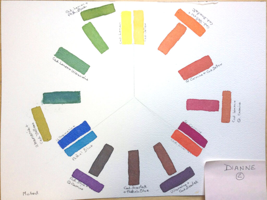
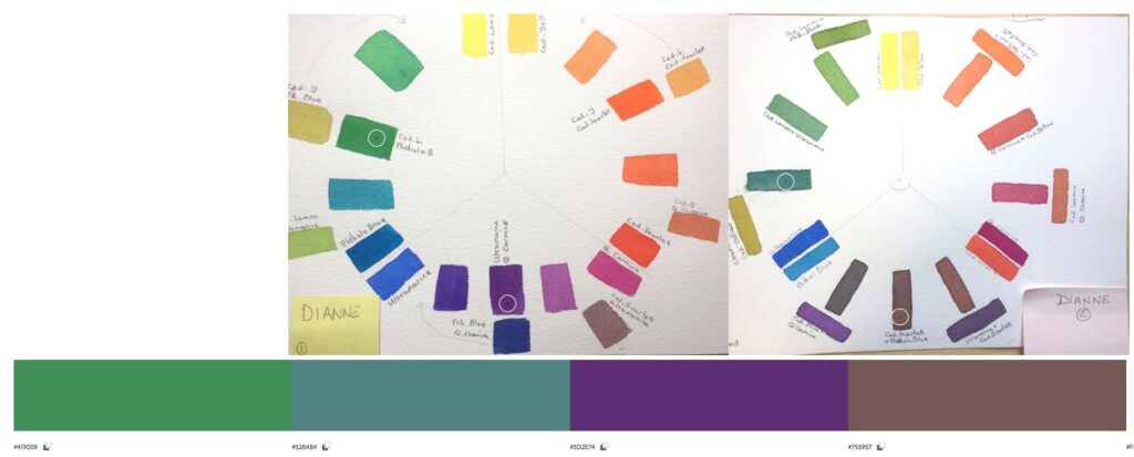
Look at the difference between the two greens & the two violets!
OK, now you can see & mix muted colours… but can you paint with them?
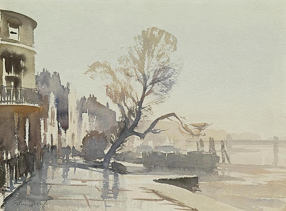
Look at Edward SEAGO’s beautifully sensitive palette of muted colours in watercolour… A harmony of colourful greys, even if he’s not using the split-primary palette. The above painting is a ‘grisaille'(a study in grey, normally made from a brown & a blue) & is probably made from Burnt Sienna & Payne’s Grey plus, maybe a spot of Naples Yellow?
Notice that the shifts in contrast are low key. It’s as if he is speaking quietly with gentle variations. And not arguing with widely differing, clashing points of view. High contrasts can be exciting but subtle low contrasts are calming to the eye. Just as a skilful musican can play in different registers, so to must a painter be able to use both muted & intense colours.
Relax into the magic of muted colours.
Yellow Ocre
In the materials list for watercolour, I recommend Yellow Ocre as the warm yellow (instead of Cadimium Yellow Deep or Azo/Hansa Yellow Deep) because it gives the lovely muted greens & browns. Also I recommend Cerulean Blue as the cool blue because it granulates (pthalo blue doesn’t). Of course these aren’t the true Split-Primaries but are visually close to them. This is an example of painters needing to adapt ‘science’ to make better paintings.
Same in Oils & Alkyds
Muted & Intense Secondaries from Split Primaries – plus white.
Note I’ve used yellow ocre as warm yellow to increase muted greens & muted orangey browns.
Exercise 3 : Paint your own intense painting using the intense split-primaries.
Lets now leave colour theory behind & set forth into real painting. The world is not made of tiny squares of colours laid out in neat circles. Reality is a jumbled up profusion of exciting colour. You learn to paint by actually painting. You learn to use colour by playing & improvising with it in the context of painting for real. So now go paint! Go play! Go improvise!
ONE RULE ONLY : Just limit your palette to intense colours (no muted colours) made from the split-primaries.
But what do I paint?
Finding what to paint can be difficult. Chosing a subject suitable to intense colours requires some thinking. You might need to re-read the exercise & then go out for a walk, looking for an intensely coloured subject. Training the eye to see colour is a large part of the art of painting.
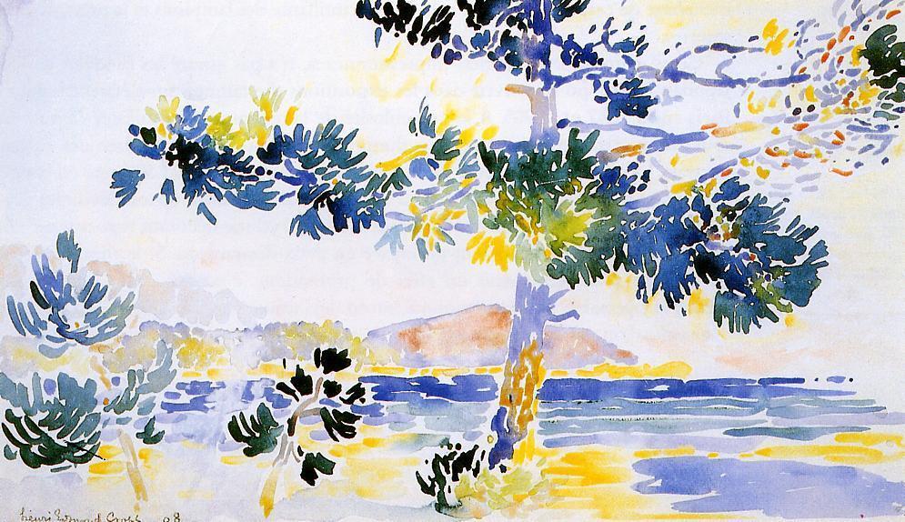
If that’s ‘not possible’ for you, then why not simply copy a bright photo? Copy a fauve painting? Copy this watercolour by Cross?
Switching Colours
You might need to change some colors around. Perhaps some colours aren’t intense enough, and need switching for a more intense colour. It is a big step to stop ‘copying what you see’ & start making paintings with strong colour harmony. This is what the Fauves did, though Hitler thought it a disgrace.
Switching colours is essential when using a limited palette. You can’t mix all the colours, so you try to get as close as you can with your chosen paints. Improvise! … And the surprising thing is that a limited palette often leads to beautiful colour harmony.
Sucessful colour in painting is all about relationships. You might have heard, “this colour doesn’t go with that colour”… … but with a limited palette, you must improvise and find which intense colors harmonize. Just like cooking, you have to balance the flavours. This means having a sense of where the painting is going, what’s seeking expression, and what’s emerging.
The infinite way in which
RUSKIN
everything alters everything else.
Exercise 4: Paint your own muted painting using the muted split-primaries.
Here again we practice ‘growth within limits.’ If a colour is too intense, then switch it for a muted colour.
ONE RULE ONLY : Just limit your palette to muted colours (no intense colours) made from the split-primaries.
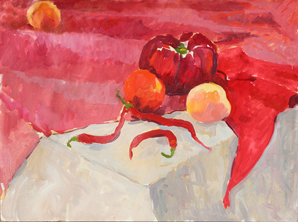
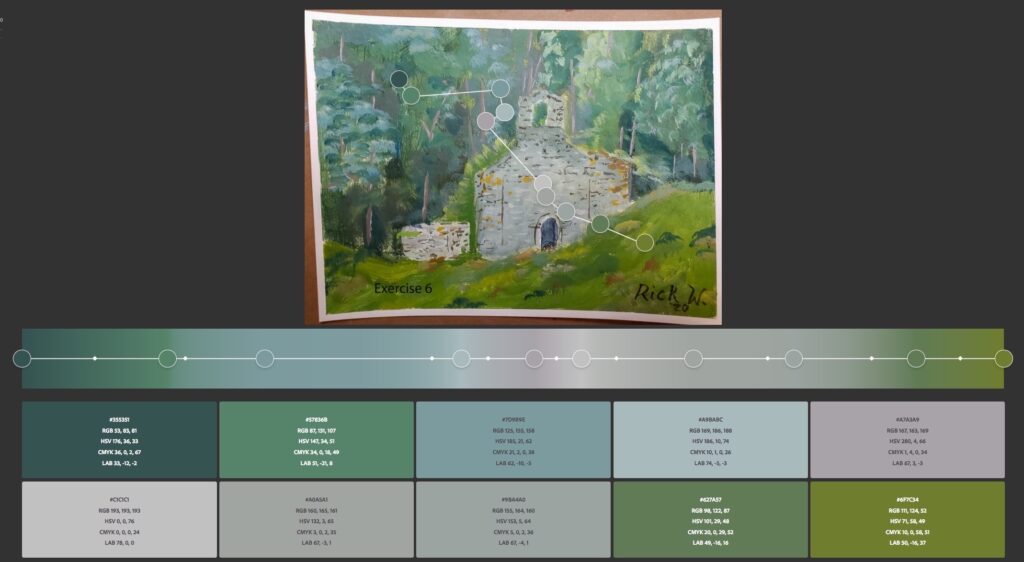
Rick has two greens – a bluey green & a yellowy green. They are muted not played at full strength. They contain grey & white. There’s a range of greys throughout which echo the stone church & give the impression of a cloudy day. The bark of the trees is made to stand out from the foliage by coming off a red, but it’s not intense. It’s a muted pink, almost grey.
Beautiful Muted Greys
Mix three muted colours together to make subtle muted greys. (Plus white for oil painting. Plus water to diliute in watercolour). NO BLACK PAINT PLEASE. See what hapens when you mix three primaries together.
IMO, muted colours often require more mixing skill than intense colour. Could this be that intense colours often come straight out of the tube? True or false?
Use contrasts of intensity & temperature, even in a muted painting
Cézanne uses muted blues, greys & browns. These muted colours give a low key, masterly, mature feel. But nethertheless, he is still using contrasts of temperature & contrasts of intensity of colour.
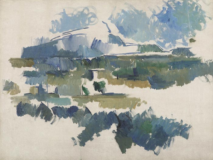
Observe the stroke of dark green right in the middle of the painting. Maybe this was the first brush stroke that Cézanne made? His statement. It’s the darkest colour, and to my eye, almost as if he has deliberately made all the other colours less intense than this first dark green.
Even in a muted painting, there will still be a few colours that have a higher intensity.
The ultramarine in the sky in the top right corner is starting to get as intense as the dark green statement. Maybe that’s why he abandoned the painting? As a painting develops & you add another mix, all the other contrasts change & evolve. Sometimes they get more intense, other times they get more muted. What was intense a minute ago can become muted, as another new colour changes everything else.
Intense & Muted colours in Watercolour
Watercolour is not intensely coloured as oils or ‘real life’. It is delicate, subtle & “silvery’… and tends to be muted. However, even in watercolour some colours will appear more intense than others. So, how you deploy these intense and these muted colours is where the artistry lays. Colour harmony. How you use colour depends on what type of painting you wish to paint.
A gentle watercolour of a green landscape on a cloudy day
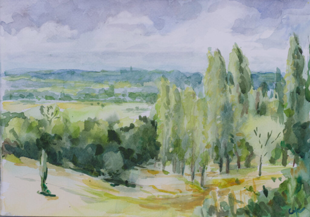
I like cloudy days. They bring relief after the brilliance of the southern sun. In this watercolour, I wanted to convey the softness of our landscape, the gentle greens, yellows & blues. The greens & yellows were stronger or intense than the other colours. So I conciously kept the blues & pinky greys muted & less intense tahn the yellows & greens.
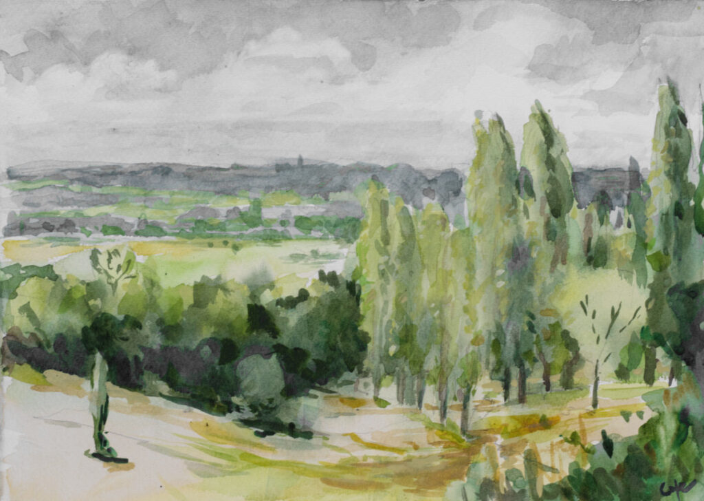
In the above image, I photoshopped out all the other colours than the greens & yellows, making them black & white, so only the greens & yellows remain coloured. Funnily enough, to my eye, these greesn & yellows also seem less intense. Colour harmony is about how to play one colour against another. Muted against intense.
Painting is the art of making burnt sienna look like vermillion.
DÉGAS
Come & show me what you have painted
Our painting workshops require you to have the colours on the materials list. At the heart of the choice of these colours, both in watercolour & alkyds, are the split-primaries. I will be assessing how you use the split-primaries, especially whilst painting ‘en plein-air’… because mastering intense & muted colours is fundamental.